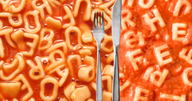
How traffic light labels work
Traffic light labelling: Why it’s flawed
- Nuances of beneficial fats and sugars are missed
- No accounting for artificial ingredients and industrial processing
- No inclusion of beneficial minerals such as iron and protein
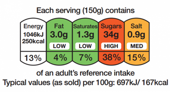
The Food Standards Agency (FSA) introduced the red, amber and green colour scheme on food packaging in the UK in response to increases in obesity and type-2 diabetes.
It was understood that consumers were largely ignoring the nutrition information on the back of packaging at the beginning of the 21st century. The ‘small print’ could inform people of the amounts and recommended allowances of fat, sugar and salt; but it wasn’t noticeable enough. Traffic lights are universally recognised as a simple indication of green for yes and red for no, plus amber covering the middle ground.
The advantage of the system is that the consumer can instantly get an idea of how healthy a product is without working out values per 100g and serving sizes. This has also influenced food manufacturers, who may be more conscious of added sugar and salt.
Misunderstood values
Where this system falls down though, is its lack of nuance and depth.
Fats
Not all fats are the same and not all fat is necessarily bad. Monounsaturated fats found in olive oil and avocados can help lower LDL cholesterol. Polyunsaturated fats include essential Omega 6 and 3 fatty acids, famously found in oily fish and some nuts.
Sugars
Similarly, traffic light labels incorporating sugar do not distinguish between forms of sugar. Lactose in milk and fructose in fruit and smoothies are given equal billing to the refined sugars in a cola drink.
Missing values
A product can be sugar-free and low fat and therefore appear angelic, however there is no accounting for the artificial ingredients that have replaced it.
Research into ultra processed foods looks at the risks associated with industrialised methods such as emulsification and refined and reconstituted ingredients. Beyond the traditional values of fat, sugar and salt, these heavily-processed products can be harmful while sometimes displaying amber or green lights on the packet.
The lines are blurred between healthy and unhealthy when industrial processing is considered. For example, a bowl of oats with whole milk can be flagged for its dairy fat content, while an over-engineered breakfast cereal with artificial sweeteners and preservatives can appear to be a health food.
Artificial sweeteners such as aspartame, sucralose, acesulfame-K allow manufacturers to eliminate sugar without sacrificing sweetness. Under traffic light rules, this means a diet cola or a “no added sugar” drink can legitimately display four green circles.
The NOVA classification
There is a strong argument for food packaging to incorporate an indication of how processed it is. Researchers in Brazil devised the NOVA classification, placing foods into four categories based on how much they have been processed during their production:
- Unprocessed or minimally processed foods such as vegetables, seeds and milk
- Processed ingredients such as sugar salt and oils
- Processed foods made by combining foods from groups 1 and 2
- Ultra-processed foods engineered with chemicals to enhance shelf-life, compatibility and palatability
So why not add a fifth coloured circle to the existing system? This new traffic light could reflect the level of processing outlined by NOVA, and give indications of artificial sweetneners and emulsifiers. This way, whole foods that have naturally-occurring sugars and oils could at least be on a level playing field with the likes of ultra-processed foods.
Beneficial minerals
Why should the potentially harmful values get all the attention? A food can also be assessed by its lack or abundance of iron, protein and fibre. After all, if you’re eating something that has very low amounts of the good stuff, you could argue that you’d fill up and risk weight gain without the nutritional benefits.